


In our modern day art and architecture, sustainability is quickly emerging as one of the most important elements of the design. The prime reason behind this is that we are becoming aware of how our exploits harm the environment. Therefore, in the near future, we are more likely to see design concepts revolving around minimalism. Earlier, it was mostly limited to Japan, but now people worldwide too people are adopting it. However, there are artists who are not even satisfied with this. They want to go even beyond minimalism. To achieve this, they have come up with negative space.
What’s this negative space?
Negative space in design is a concept which seems simple but can be a little tricky. When used intelligently, it allows other elements of the design to stand out and fulfill their purpose. White space is the unused space in the design, and good designers know how they should use white space, or rather not use any space.
Professional designers know when to stop adding more elements in their designs and their ‘less is more’ approach seems to work out much better than the heavy handed approach of amateurs. So how do you use negative space in design? Here are a few pointers to use white space as a powerful element in design:
Negative space in type

Type or text in a layout should be easily readable, making it easier for the reader. Text should flow easily, and yet be a part of the design. Some designers consider text as more of a design element and do not care about the readability, thus neglecting the white space or leaving very little negative space. Negative space between lines, called leading makes type legible. Lack of leading makes the type readable and visible, which attracts the reader, which is exactly what the designer wants. Thus the proper use of negative space in type is crucial to the graphic and can thwart or attract the reader.
Negative space to highlight CTA and other elements in design

Negative space may be used to highlight CTA or a particular detail or image that the designer wants the audience to focus on. People generally use it in product photography to direct attention to a particular aspect of the image. A brilliant negative space design is one which make the viewer become engrossed in the design and take action, which means a successful call to action. For example, white space in a logo design may appeal to a viewer or reader to such an extent that h/she remembers the logo and buys that company’s product.
Negative space in the design planning stage

While planning a design, designers often plan meticulously for the elements which are going to be printed into the design, for example, the typography, the photos or artwork etc but not for the negative space. A successful design is one which takes into consideration the negative space too at the planning stage and intentionally uses it as part of the design. This lets the design come into fruition without the any hassle at the end, as white space is already planned for in the beginning.
Composition and space

A composition looks crowded when there is no breathing space or room which can be provided by negative space. Negative space has a different way of communicating with the brain than regular design. It lets the brain make sense of positive images, such as a logo or image which has had negative space designed into it is more impactful than a predictable design. The designer can choose any shade or color to contrast or compliment with the design. And leave the white space around cleverly to make a difference. The amount of space left as a result of necessity or as part of the plan in the composition enhances or mars it.
Negative space is used to reveal another image sometimes and many designers have used negative or white space to their advantage to make a design stand out in the memory of people. One of the most famous examples of positive and negative space is the example of two faces or a vase. If one sees faces, then the black areas are seen as positive space and if a vase is observed, then the white area becomes the positive space, leaving the background as negative space.
Negative space in minimalist design

In minimalist designs, handling positive and negative space as there are fewer elements and white space becomes a part of design rather than being just an effective background for other elements.
15 Creative Examples of Using Negative Space in Design
Many artists and designers have used negative space cleverly and the resulting work of art of graphic has become unforgettable. In advertising, many logos and ads have been able to establish the identity of the brand they represent through the use of negative space. Check out these 15 examples which have used white or negative space creatively:
1. Philips LED torch

The ads designed using negative space cleverly, focuses on the functionality, rather than the product. The visual is extremely powerful and manages to grab the attention of the viewer. The light reveals the sky, with just a hint of the surroundings.
2. Fiat’s don’t text and drive campaign
The visuals of Fiat’s “Don’t text and drive” campaign portrays exactly how you can be completely blindsided while texting which is extremely dangerous for the driver and other cars on the road. If you see only the letters, which is the white space, you do not see the animals, kids, or road signs which is what happens when a person texts and drive, as his attention is off the road.
3. Sukhi Barber’s sculptures

Ms. Barber’s sculptures are a fusion of western and eastern philosophy, sculpted to perfection making difficult philosophical concepts accessible and understandable to people. She emphasizes the use of negative space as being as important as the materials she uses, which uses positive and negative space to imply the constant transformation.
4. Save the penguins
This ad is a striking example of white space being used to convey the client’s message. Designed by Andrew Hofmeyr, it is the perfect visual of tipping point. Anyone looking at the visual will be able to note the positive and negative space used equally to perfectly balance the composition.
5. Toblerone
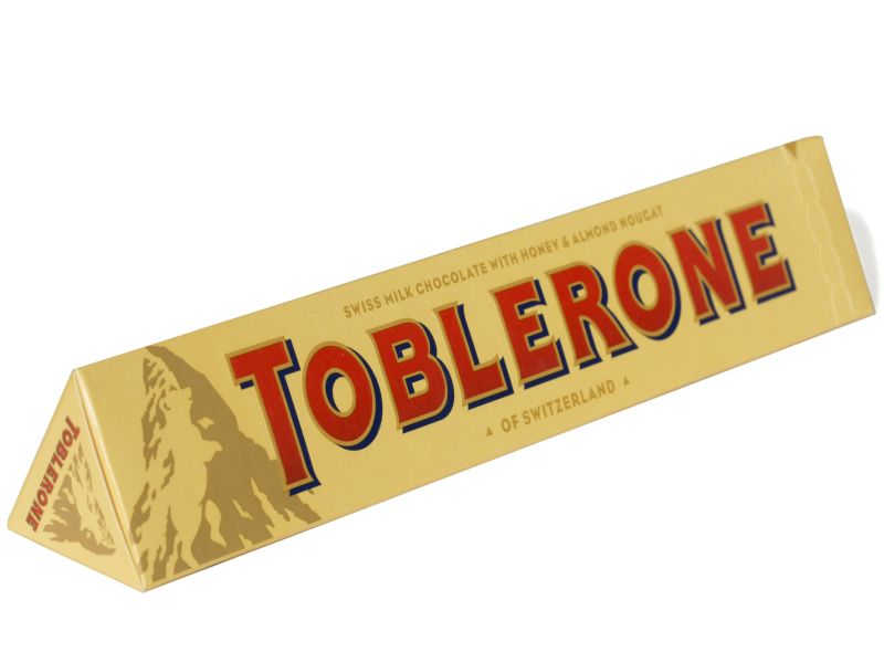
Logos are crucial to a brand’s identity. The logo of Toblerone is a very good example of negative space. The Matterhorn mountain is pretty clear, but the bear, representing the city of Berne, can be identified on looking closer.
6. The “Brave” poster
The poster of the movie “Brave” in four color used negative space to illustrate the moment when the mother was turned into a bear accidentally.
7. Martini House
This logo for Martini House is another brilliant use of negative space.
8. African Safari

This is a very clever use of white space and it takes a minute to register. The elephant can be made out clearly but the outline of Africa in white space between the elephant’s legs can be seen after looking at the graphic for a while.
9. Volkswagen AD
The negative space in place of the product in this ad by Volkswagen highlights the space where the product should be.
10. NBC

NBC’s peacock in the logo has undergone many changes since its introduction in 1956. The peacock’s body finally is displayed now as negative space in the logo.
11. Mr Cooper
Gourmet ice cream brand Mr Cooper’s logo was designed by the agency as a stunning and eye-catching identity using bright pink color and white space. This distinctive logo has been designed to be used on merchandise, packaging and uniforms.
12. The World Food Programme video
A busy lifestyle and being exposed to horrifying stories every day has made us insensitive to the plight of those less 13. fortunate than us. This video about the situation of refugees is powerful and effective, because the makers of the video have used evocative visuals which focus on the need for peace and eradication of hunger in the world.
13. VIA rail

Image Surce : i.cbc.ca
The negative space between the letters V, I, and A, you will see 2 parallel lines which represent tracks and if the logo is rotated by 180 degrees, it still looks the same.
14. Pittsburg Zoo
A perfect play of negative and positive space is this logo of Pittsburg Zoo, complementing and contrasting each other.
15. Attix
A print commercial which highlights the core functionality of the product.
Negative space has been used effectively and creatively by designers and artists to portray their message making it a powerful tool in design.