
Typography is an art form which a few designers around the world excel in. We are introduced to a new world of letters and typeface which look like what they mean. The artists have created interesting illustrations which can help you to learn some words of a particular language, for example Chinese or Arabic. The creativity of the artists / designers is to be admired, as they came up with a new expression of the same type that we all use. Read on to see for yourself some examples of typography and illustrations which are truly beautiful:
Typographic animals- Dan Fleming
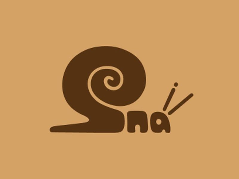
Image Source : cgfrog.com
Dan Fleming, originally from Australia but based in USA (Boston) specializes in logo design and branding. He is an expert in using illustrations to convey meaning, which is what logo design is all about. His grasp of visual knowledge is put to good use in his project ‘World Animals’, in which he expresses the names of animals through typography. The type forms the silhouette of animals so that you would see the shape first and then read the letters that form the name. For example, you’d see the shape of the Giraffe, Penguin or Dinosaur, before you’d realise that the images are actually the spellings of the animals’ name.
Arabic words illustrated to explain their meaning
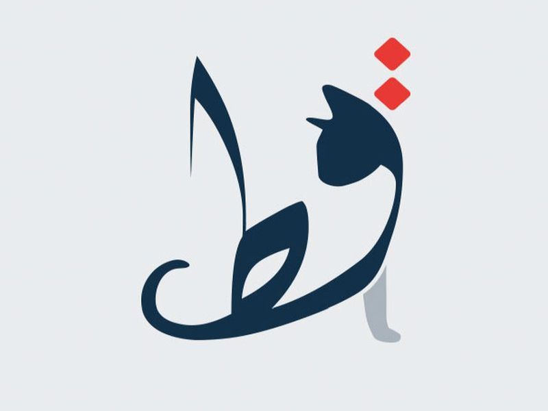
Image Source : demilked.com
Mahmoud El Sayed is an architect and graphic designer whose fascination with word manipulation led him to illustrate Arabic words beautifully. He went a step further to successfully illustrate the words which also looked like their meaning. He transformed 40 Arabic words into their literal meaning, and also provided their Arabic pronunciation, so that those who were unfamiliar with the Arabic language would also learn a few words of the language, such as the word Cat which is pronounced as ‘Qitt’ , or Whale pronounced ‘Hout’ in Arabic. And also be surprised to discover that some words are the same, such as Koala or Giraffe – Zarafa, which is close enough!
Chineasy by Shao Lin
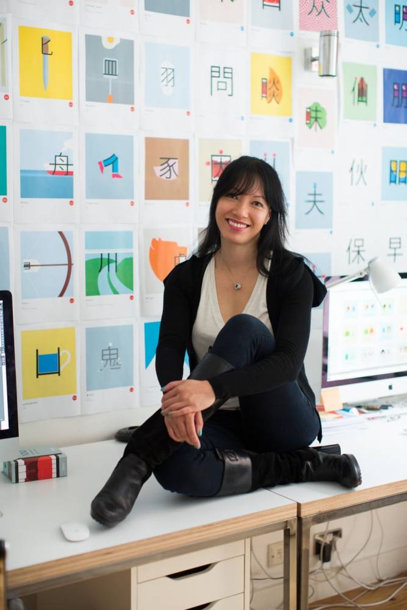
Image Source : metrouk2
The Chinese language is considered to be one of the world’s most difficult languages. It is composed of many different characters which look like designs, to people unfamiliar with the language. Shao Lin, who is a teacher of the Chinese language had the brainwave to use the letters as illustrations which represent the meaning of the words. He developed ‘Chineasy’ – graphic characters that make learning the Chinese language intuitive and fun. Any student can remember the Chinese word by looking at the eloquent illustrations, which make it much easy to recognize the characters without the visual later on.
Word Images by Ji Lee
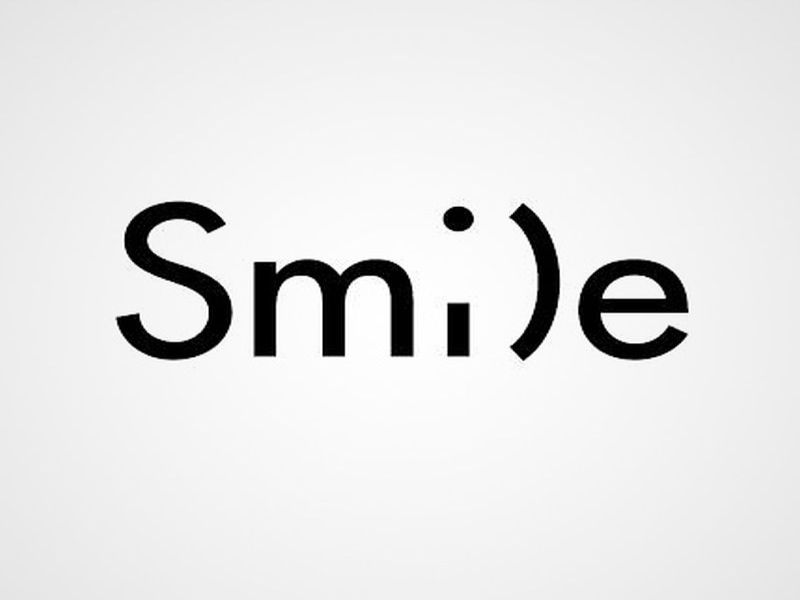
Image Source : static.boredpanda.com
Ji Lee, an illustrator and graphic designer is a world citizen. He was born in Korea, raised in Brazil (Sao Paolo) and is currently based in New York. He worked for many of the world’s best advertising agencies such as BBDO, Publicis, Saatchi and Saatchi, Euro RSCG. He worked for Google too and then joined Facebook. ‘Word as Image’ is his personal project in which he ‘draws’ words, deigning them to depict their meaning. In certain cases, his word images depict the essence of a person or an object.
Typographic posters by Arun Raj
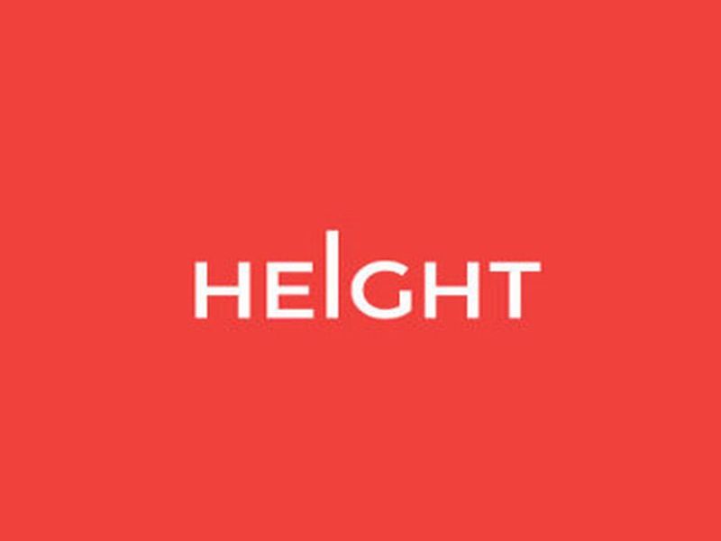
Image Source : designbolts.com
Arun Raj, a graphic designer from India, created some eye-opening posters using typography. He uses just the words to form their meaning. He has cleverly designed the posters in which the alphabets of the words function according to the meaning. For example, in the poster for the word ‘Sinking’, the letters droop downwards to actually sink into the bottom half of the paper. The word ‘Balloon’ has the two ‘o’s floating up, and the letter‘s’ of the word ‘fish’, forms a hook and so on.
Paper typography
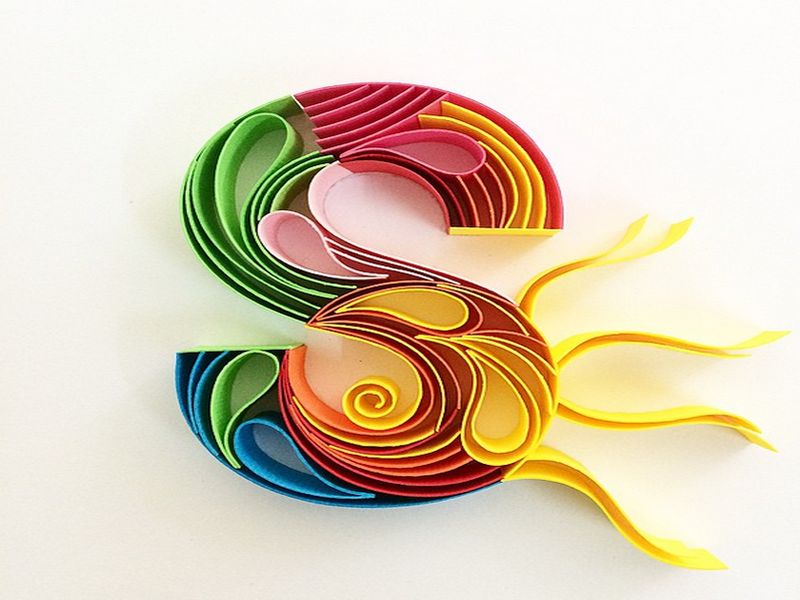
Image Source : typostrate.com
Sabeena Karnik, an Indian artist, has used paper strips of different colors to create exquisitely beautiful typography. She has designed all the 26 letters of the English alphabet, using paper loops and whorls along with thin strips used vertically and horizontally.
We are constantly using typography or are exposed to it in some form or another, through newspapers, advertisements, internet and social media. But it takes an artist to use the same type in an original manner to reveal the intricacies of typography.