

You’ve seen web trends come and go over the years. But one consistent characteristic that is here to stay forever is simplicity. More companies are opting to go with simple designs with a streamlined front page. They create the most relevant message to their target audience and guide them down an intuitive and logical path that leads to a defined goal.
Here are 10 websites in 2017 that use successful streamlined website designs.
1. FreshBooks
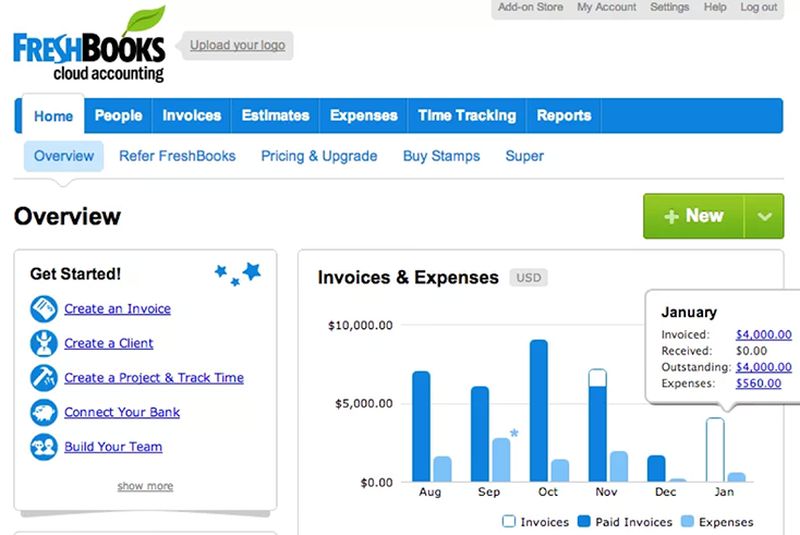
FreshBooks is a well-known accounting software designed for small business owners. The company hits you right off the bat with an offer to try their software for free. As you scroll down, they give you three strong unique sales propositions. Then, they move down to various features. That is followed up by strong testimonials. They don’t do a boring feature list like many web hosting sites. Every single part of the presentation moves the users forward to getting them to sign up for free.
2. Airbnb
Airbnb has changed their home page many times over the years. This new one seems to be one of the better iterations. It offers the search function to help the target user find the rental they’re looking for. However, Airbnb is a unique service as they offer travel experiences, tours, and also provide a service to property owners. They streamline everything by starting with the obvious search function, then serving their second most important users (the homeowners), and finish it off with their experience and tour listings. They manage to present multiple services via a streamlined and organized design.
3. Medium
Medium is a socially generated news site. The challenge is obvious. How do you effectively teach your user what your service is about? The answer is to ask them for their number to get a text for their app download link. Then, provide them with a sample of some great stories to give them an idea of Medium’s value. To take to another level, you see a listing of exclusive stories that you can only unlock when you become a member.
4. Kind
Kind is a healthy snack bar company that streamlines their web design through their navigation. Each navigation tab is basically a link to a different product line. The main headline has a clear selling proposition and invites you to purchase some of their snacks with a web button that stands out. Below that you’re given options for learning more about their products. Kind does an incredible job in educating the user and providing a sales opportunity throughout the presentation process.
5. Mint
Mint is an app-based service that helps you manage your finances. It starts off with a simple hero image with a link to sign up for free. This is followed up by multiple features that are explained with accompanying images of the app. Throughout the presentation, you’re given options to sign up and learn about their security features so that you feel safe managing your money on the platform. This is a clean and simple streamlined design that works.
6. Dropbox
Dropbox starts out with a common hero image with an offer to try their service for free. But this is followed up by a web hosting type setup that lists the different features based on the various price points. They get straight to the point about explaining their services for interested customers. Below the comparison table, you get a streamlined sales presentation with real images of the software in action.
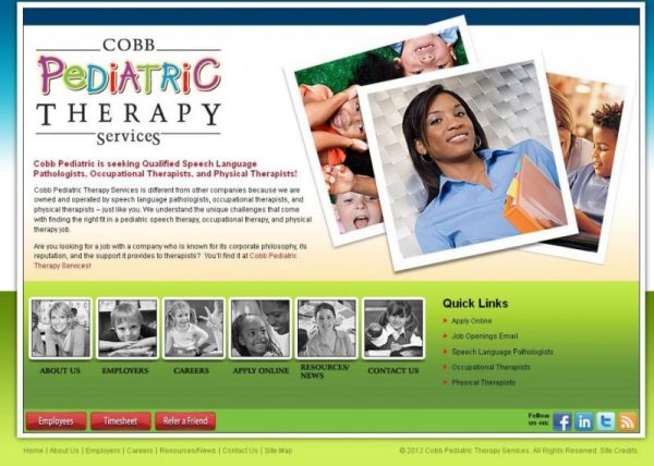
7. Cobb Pediatric
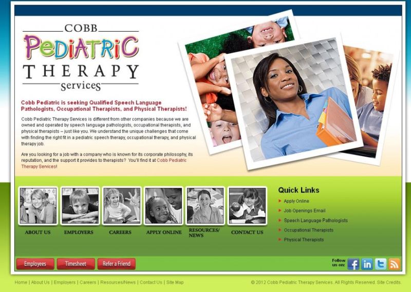
Cobb Pediatric is a website that helps pediatric therapists find jobs. They also use a hero image but what makes them different is that they use a footer that follows you throughout the whole website. The footer provides a link to apply for a job that can be collapsed. Below that, you’ll find listings of featured jobs and a search function that helps therapists search their database. The site is streamlined and set up to make sure that you always come back to either applying for a job or looking for a job.
8. Telerik
If you have multiple products, you need to figure out how to streamline your web design. Telerik does this by featuring three of their most popular products right next to each other and offering a free trial or more details about each one. They back up the credibility of their products with brands that use their products, awards they’ve won and convincing statistics about their products.
9. eWedding
eWedding is a service that allows couples to set up their own wedding site. They have an amazing streamlined presentation that starts off by offering users to start their own site or take a look through all their design themes. Below that, users are presented with a feature list which is followed by a video tutorial. Each part of the presentation offers users the option to start building their site or look through the available themes. It closes off with some great testimonials to try to convince the user one last time to give their service a try.
10. Basecamp
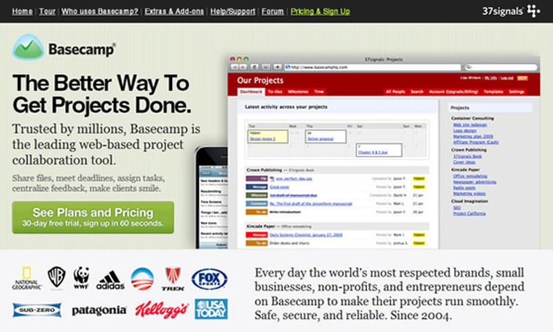
If your product or service is complex, how do you streamline your design to get your users to learn more about it? Basecamp answers this question by going strictly for the lead. They don’t bother to go too in-depth about what their service does. They state their unique sales proposition and back that up with testimonials and press stories. If the user really wants to know how their service works, they have to click on the link at the bottom of the page where they’re taken to a video presentation.
As you can see from these examples, each website has streamlined. Even the most complex product or service needs to be streamlined in a simple manner. The design needs to be set up so that users understand what they’re being offered and are given the right options at the right moments to take action. Take these examples and see how you can apply it to streamline your own design.
Article Submitted By Community Writer