

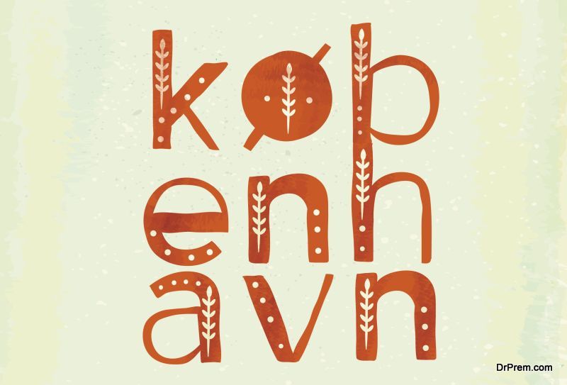
Kerning is a designer’s tool to make their typeface professional. Kerning is adjusting the space between letters which makes your type visually pleasing. There are thousands of fonts available but still, you can create your own font and make a mark with kerned type, (among other considerations), which makes your design unique and strong. You can be counted among those expert designers and stand out with your understanding of typography, and kerning plays a major role in that. Here are 10 mantras you need to get kerning right.
The choice of typeface should be done early on
Every typeface has its own unique character so you have to adjust according to the typeface you have selected. The adjustment of space between the letters is specific and different for each typeface so the selection of typeface should not be left till the end of the design process.
Remember tracking and kerning is not the same
Tracking and kerning are very different and you should never assume that they are the same.
Tracking is the controlling of the uniform space between all the letters in a text but kerning is controlling the space between two letters. You should make the adjustments to leading and tracking first and then do the kerning or else you would disturb the kerning adjustments.
Consider the whitespace

Some letters are tougher to ‘kern’ than others, say LA is difficult to kern than AV. Letters which have a greater slant and do not conform to the block shape tend to be problematic. Overhanging “T” bars and “Y” arms cause problems when they’re used as initial capitals, making the lowercase letters which follow them seem as having more space between them. In cases like this, you have to focus on the whitespace or negative space between the letters and try to balance it.
Upside down kerning
This involves flipping the type before kerning and it is an extremely simple but effective method of seeing the space between the letters clearly, without being distracted by words. You can do a great job of kerning using this simple technique.
Consider word spacing
Many fonts, especially free ones have a lot of spacing between words. This can become a problem when you are kerning, as you have to keep a check on the space between words too. You have to see that while kerning you don’t distort the font further. A good idea is to avoid kerning fonts which have a huge amount of space between words.
Blurring the eyes
While kerning, you can get a better result if you blur your eyesight a little by crossing or squinting your eyes. This enables you to focus on the whitespace and contrast of the letter shapes without being distracted by the words or text.
Provide options for logos
Logo typefaces are usually viewed at very small or very large sizes or you would need to kern for both options. Experts recommend tightly kerned letters for large and loosely kerned pairs for small sizes.
Get the spatial relationship right

A good way to gauge the kerning distance is to view the distance between two straight letters as one unit, slightly less than one unit for the distance between a round and a straight letter, and even lesser distance between two round letters.
Kern in three letter groups
You can do this by kerning the first three letters of a word and then focus your attention on the other letters, till you complete the word.
Don’t over-kern
Type that is over-kerned i.e. is too tightly spaced is unreadable and unattractive. Kerning little is better as it makes text readable and attractive.
Practice kerning a lot
Practice will make kerning perfect and you can practice by playing kerning games which will score your solutions and let you know how good a typographer you are and help you improve.
Kerning is an important part of the art of typography and contributes to the success of a design of a logo or display typeface. It should be done in the earlier stage of design, as then you would be spared the rush and be able to do a better job of kerning. It helps your design stand out and indicates your professionalism and expertise in the process of design.